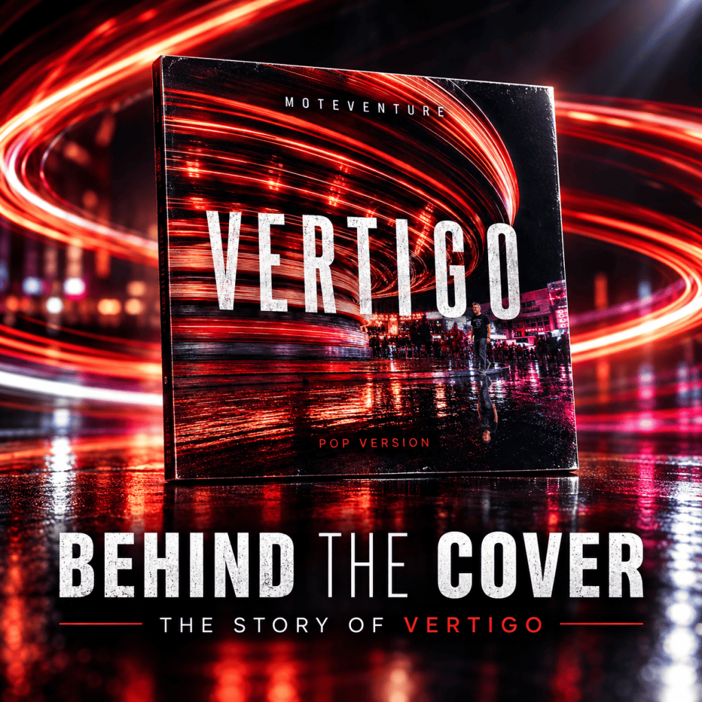
Over the past few weeks, I’ve shared the songs, stories, inspirations, and ideas that helped shape Vertigo.
Today, I want to talk about something listeners see before they hear a single note:
The cover.
Like the album itself, the artwork is about perspective.
And like many creative decisions, it took on a deeper meaning the longer I lived with it.
First Impressions Matter
Long before someone hears Avalanche, 1979, or No Place Like This, they’ll encounter the cover.
An album cover has a unique job.
It doesn’t tell the entire story.
It simply invites you inside.
It offers a glimpse into the world waiting behind it.
For Vertigo, I wanted the artwork to capture the same feeling that connects the songs themselves:
Motion.
Change.
Perspective.
The sense that something familiar has suddenly shifted.
More Than Just a Title
When people hear the word “vertigo,” they often think of spinning.
Disorientation.
Losing your balance.
That idea certainly influenced the visual direction of the artwork.
But over time, I realized the album wasn’t really about falling apart.
It’s about finding your footing after the world changes around you.
Many of the songs explore those moments when life forces a new perspective.
A relationship.
A memory.
A risk.
A realization.
A truth that’s difficult to ignore.
The artwork became a reflection of those ideas.
Looking Back
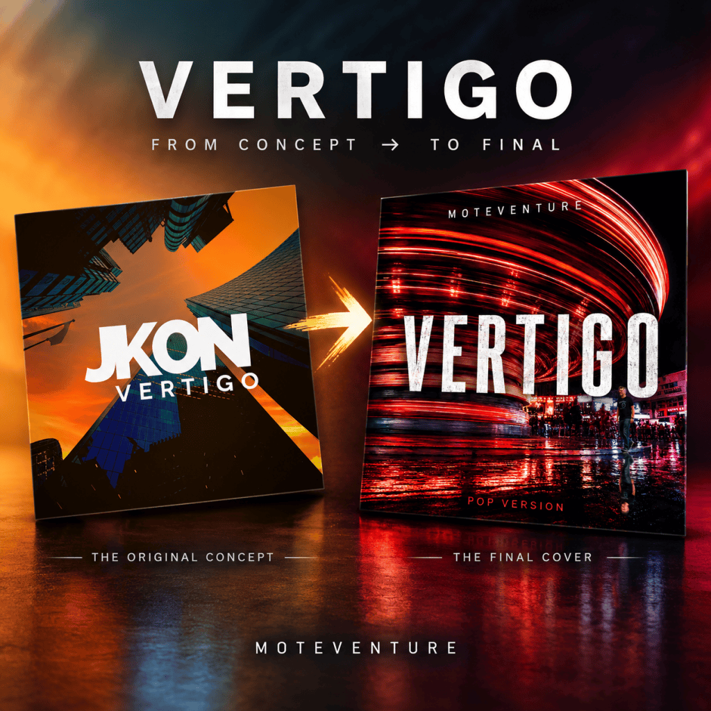
One of the most interesting aspects of this project is that Vertigo existed in some form long before the album you’ll hear on October 30.
Years ago, while recording under the name JKON, I imagined a very different version of this album.
The songs changed.
The sound changed.
The artist changed.
Even the artwork evolved.
Looking at earlier concepts beside the final cover reminds me how creative projects often find their true identity through the journey rather than at the beginning.
The Colors of Vertigo
Throughout this countdown I’ve talked about perspective quite a bit.
That’s because perspective became the thread that connected almost everything on the album.
Love changes perspective.
Memory changes perspective.
Distance changes perspective.
Time changes perspective.
Even the closing track, No Place Like This, uses color as part of its storytelling, drawing inspiration from The Wizard of Oz and the transition from black-and-white uncertainty into something vibrant and alive.
Looking back, I realize color became an important metaphor throughout the album as well.
The Front and the Back
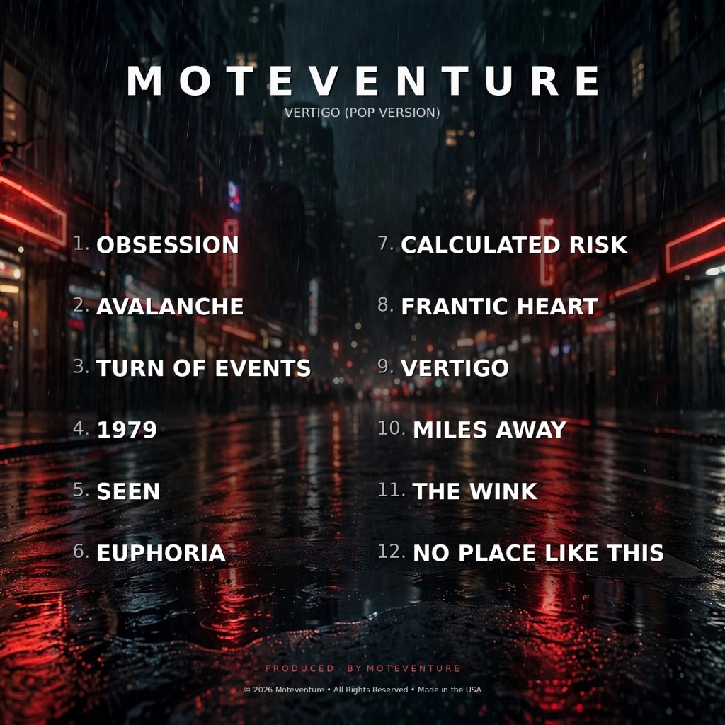
If the front cover asks a question, the back cover provides a few clues.
Seeing all twelve songs together was one of the moments where Vertigo finally felt complete to me.
Not because the album was finished.
Because the story was visible.
The journey begins with Obsession.
It ends with No Place Like This.
Everything in between exists somewhere along that path.
What I Hope You See
Every listener brings something different to an album cover.
One person notices the colors.
Another sees movement.
Someone else notices a small detail that wasn’t even intentional. Hint: If you look closely, you’ll find me – living my best life outside the spin.
That’s part of the beauty of art.
Once it’s shared, people discover meanings that may never have occurred to the creator.
My hope is that when you see the cover of Vertigo, you feel a sense of curiosity.
A feeling that something is about to begin.
Because that’s exactly what these songs represent.
A collection of moments where perspective changes and life starts moving in a different direction.
Almost There
The countdown is nearly complete.
Tomorrow I’ll share a personal message as we reach the eve of release day.
Until then, thank you for joining me on this journey.
days
hours minutes seconds
until
YOU’RE FEELING VERTIGO
“The album wasn’t really about falling apart. It’s about finding your footing after the world changes around you.”


Hey there — I’m Jon. This is Moteventure, my corner of the internet where music, movies, lists, and life all collide. Glad you’re here.